
Advanced Tabs (Divi)
Tabs for Divi 5 that go well beyond the built-in Tabs module: six styles with a sliding indicator, tabs on any side (per device), icons, images, subtitles and badges, an accordion, dropdown or swipeable strip on phones, autoplay with a progress bar, hover switching, arrow keys, content animations and deep links. Each tab is an Advanced Tab child module whose content can be text, a shortcode or a Divi Library layout.
1. Sliding underline
The default style: an underline slides to the active tab · Font Awesome icons and subtitles · links in the address bar (#hoodies, #tees, #crops) · becomes an accordion on phones.
Heavyweight hoodies
Brushed inside, double-layer hood, kangaroo pocket. Three colours, sizes XS–XXL.

Everyday tees
Combed cotton, a relaxed fit and a print that lasts.

Crop tops
Cropped and boxy, in white, blue and yellow.

2. Pills on the left, with images and badges
Tabs on the left (260 px), on top on tablets and phones · pills with a pointer · image media and a “New” badge · slide-sideways content animation · a dropdown menu on phones.
Mint hoodie
Light and fresh, with a relaxed fit.

Lilac hoodie
A slimmer cut with a longer back.

Sand hoodie
The one that goes with everything.

3. Segmented, autoplay
A segmented control, centred · autoplay every 4 s with a progress bar and a pause button, pausing on hover · the height stays steady · rise animation · a swipeable tab strip on phones.
4. Cards, hover and rich content
Cards with the icon above, equal width · switches on hover (click on touch) · arrow keys move focus only, Enter opens · the tabs hold text, a Divi Library layout (a Text and a Button module) and a WordPress gallery shortcode.
Who we are
A small studio making clothes that last, cut and printed to order.
Any Divi modules can live in a panel
This panel is a Divi Library layout — a row with a Text module and a Button module — chosen in the Item’s Content Type.
-

- Photo by cottonbro studio on Pexels
-

- Photo by Ron Lach on Pexels
-
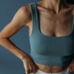
- Photo by Roman Odintsov on Pexels
-

- Photo by MART PRODUCTION on Pexels
5. Finished design
Boxed folder tabs on a dark page, on the right on desktop and on top on phones · custom colours for every state (slate → white on hover → amber when active), a dark bar, an amber indicator, amber badges, a dark content box with light text, Georgia titles.